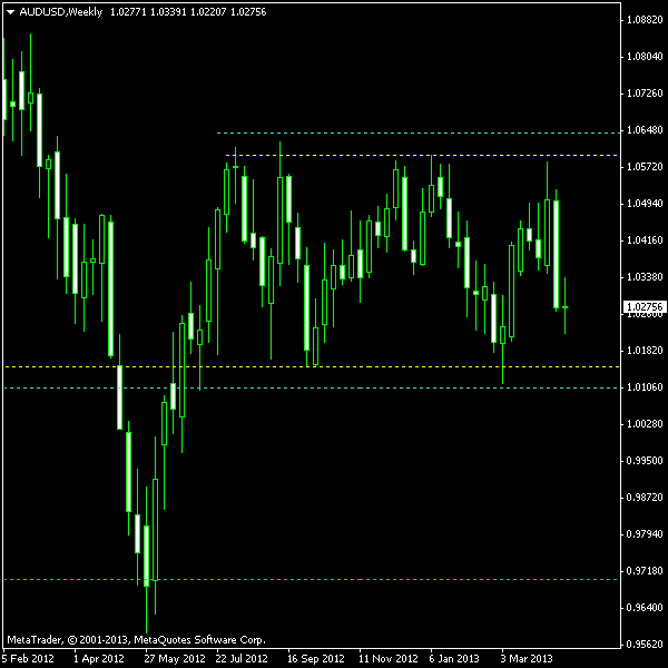
The Australian dollar has been consolidating since 2011 on its weekly chart. Now a definite and clear rectangle pattern has formed with the first bar positioned back in July 2012. It has multiple touches of both upper and lower borders. The rectangle (or horizontal channel) may turn out to be either a reversal or continuation pattern. Since this one is following a pretty rough sideways trading period, both bearish and bullish breakouts may be considered for entry.
With my disastrous performance record for 2013 (5 losses out of 5 trades so far), I would not recommend anyone follow my trades other than for the purpose of entertainment, but anyway I feel compelled to share my trade setups, just for history. The chart below shows the rectangle outlined by the yellow lines. Entry (cyan) and

You can download my MetaTrader 4 chart template for this AUD/USD pattern. You may also use my free Chart Pattern Helper EA to trade this pattern.
Update 2013-05-09 21:44 GMT: Short position triggered about three hours ago with entry at 1.01045, SL at 1.03078 and TP at 0.97018.
Update 2013-05-22 15:11 GMT: My sell position has reached its target level of 0.97006 and closed at 14:39 GMT today. Quite a nice breakout scenario.
If you have any questions or comments regarding this rectangle on AUD/USD chart, please feel free to submit them via the form below.