Update 2012-01-21: It looks like there was a major error in the MetaQuotes hourly data for the currency pairs. The first several years of data was only one hour per day, and that day was 00:00 server time or exactly 23:00 GMT. That’s why there was such a high peak in the last day’s hour average bar. I am now updating all the pictures and the respective descriptions to fit the real market statistics. The statistics script is also updated to let the user skip first N bars in the chart.
In theory, the hourly statistics of the currency pairs should be pretty consistent in Forex. Some pairs should be traded more actively during the European session, some during the US trading session, and others during the Asian session. Of course, the conjunctions of the sessions should be even more active for some of the currency pairs.
Fortunately, the availability of the MQL coding language and the simple accessibility of the H1 data for any currency pair in the MetaTrader 5 platform make it really easy to test the above assumptions. I’ve created a script that would gather the (High — Low) values and calculate the average for every hour of the day. Then I applied it to several major and cross currency pairs to find out the most active and the stillest hours of the day for them.
The results turned out to be quite surprisingusual. Although I have expected to see the peak of activity for most currency pair during the time when both Europe and the USA are trading, I haven’t expected at all to see the highest hourly average between 23:00 and 0:00 GMT. This hour beat any other hour on all but one currency pair that I’ve checked. The only explanation that I have is that it coincides with the weekly Forex market opening and the beginning of the Asian session, making it very volatile.
Below, you will find my statistics for the following 11 currency pairs: EUR/USD, GBP/USD, USD/JPY, USD/CAD, USD/CHF, AUD/USD, NZD/USD, EUR/GBP, AUD/JPY, EUR/JPY, GBP/JPY. But you can easily get the same histogram charts for any other currency pair. Just follow these instructions:
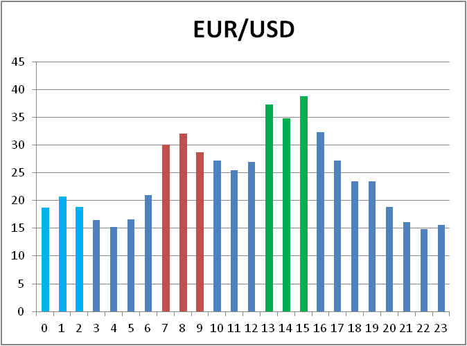
EUR/USD shows the logical pattern — the first area of volatility is the first few hours of the European trading session and then peaks when the US session opens with Europe still in game. The last hour trading still beats them all with almost 40 pips of average difference between the hour’s High and Low levels. The peak hours are colored the same way in all the presented statistics charts: the European session beginning is red, the US one is green and the three most active hours of the Asian sessions are light blue.

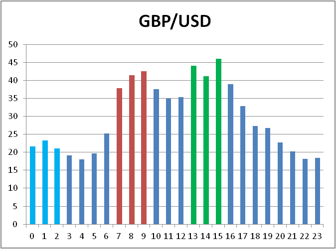
GBP/USD is very similar to EUR/USD, except for that the European start is visibly shifted one hour forward and this peak is closer to the US/Euro But the 23:00 hour average is even higher here.
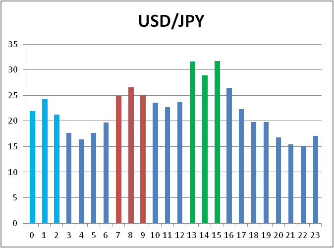
USD/JPY is less active during the European and the US Forex sessions, but peaks most prominently during the last hour of GMT day. is almost as active during the Asian session hours as during the European one but peaks during the US session.
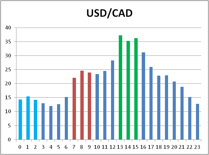
Unsurprisingly, USD/CAD shows a uniform peak during the US trading session and doesn’t rise much during the European FX session open hours. Even the 23:00 average is below the 4 most active hours of the US session.
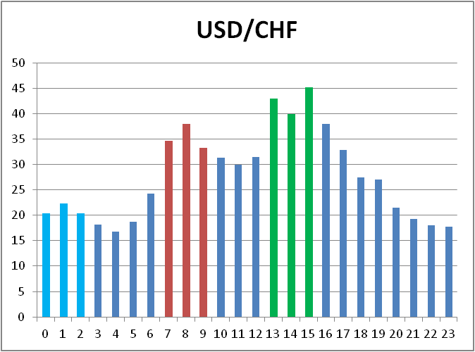
USD/CHF looks quite similar to EUR/USD and there’s nothing unexpected here — after all, Switzerland is very close to the eurozone, both economically and
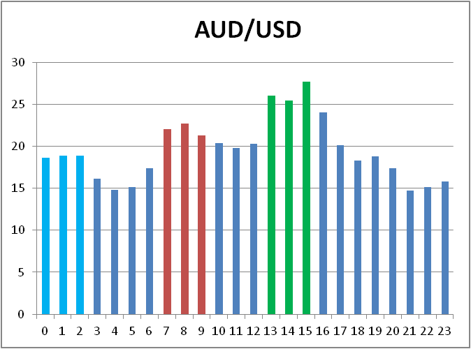
AUD/USD is surprisingly similar to EUR/USD too. Except that its first 23 hours are smoother than in EUR/USD and the last hour goes farther up. its volatility distribution is much smoother.
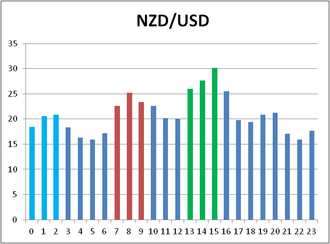
NZD/USD hourly volatility picture is a much smoother version of USD/JPY. Looks like the first hour of the Asian market session accounts for the biggest changes in this pair.
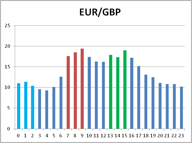
EUR/GBP is a purely European currency pair and this is easy to spot on the chart below. The first three hours of the European session beat the first three hours of the US session. Which is a rare trait among the FX pairs.
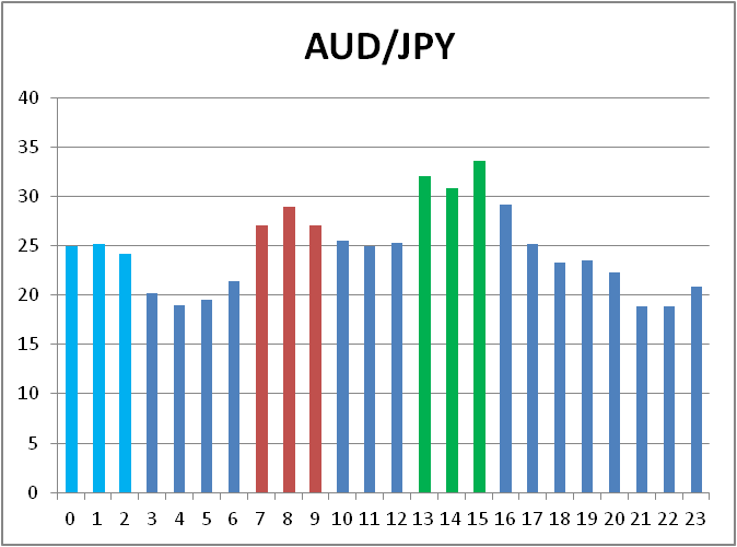
AUD/JPY is similar to USD/JPY, but with more weight given to the last hour of the day (in GMT timezone) and less weight given to the usual European and US peaks.
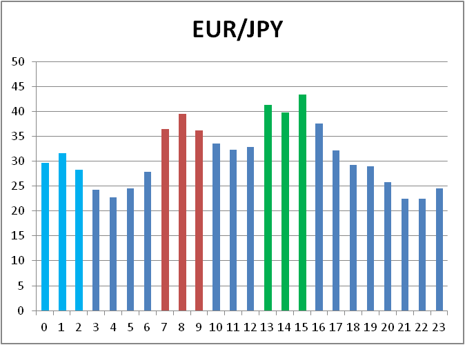
EUR/JPY isn’t very different from the chart above, but is less smooth during the first 23 hours shows higher volatility during the colored active session hours.
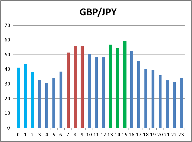
GBP/JPY looks almost identical to EUR/JPY and is provided just for “completeness”. Though the European session here is slightly stronger than with the EUR/JPY chart.
But how do I use this data? That’s a good question there. Some of the uses I could think of are:
If you want to share your opinion, observations, conclusions or simply to ask questions regarding the hourly Forex stats, feel free to post them using the form below.