
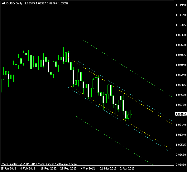
The Australian dollar is supplying some interesting patterns nowadays. Last week it was H&S on AUD/JPY, today it’s a descending channel on the daily chart of AUD/USD. The currency pair has entered the downward trend in early March, following a consolidation after a rather
The borders of the presented channel pattern are rather rough and there is a high probability for false breakouts, even when using a 10% buffer zone. Also, the descending channels aren’t very well suited for trading the upward breakouts, so I wouldn’t suggest trading on the bullish side here.
As you can see on the chart below, the yellow lines mark the borders of the channel. The cyan lines mark the 10% buffer zone for entering a breakout trade, while the green lines mark the target levels for taking profit. The green lines are located at 100% of the channel height away from its border. The breakout bar will show us the
Update 2012-04-12: Entered long position at 1.0398 with the
Update 2012-04-23: Exited at
Update 2012-04-27: Could have used another
If you have any questions or comments regarding this AUD/USD chart pattern, please feel free to reply via the form below.